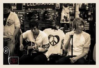
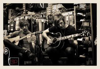
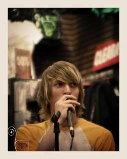
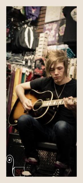
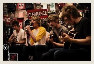
I mentioned on my last blog that I'm searching for a logo...
Or maybe I should say I'm attempting to create one that I'll be happy with.
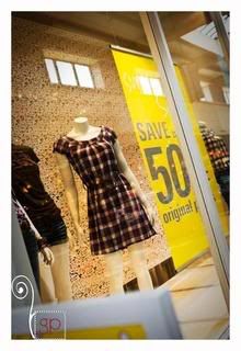
See, the original one was just too bulky. It seemed to weigh down my pictures... I knew I would eventually have to find an alternative.
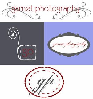
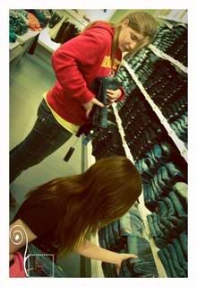
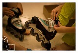
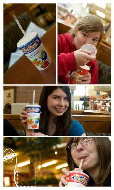
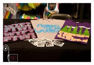
Here are the attempts:

#1 too bulky, #2 kind of silly, #3 too girly (I attempted to put it on Finding the Warren pictures and it didn't mesh)
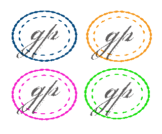
Thus, I needed something that worked with all types of pictures, wasn't too bulky, and looked decent. This is where I discovered my ability to make #4.
The great thing about #4? I turned it into a brush & can just stamp it on pictures in any color (I like color!)

What do you think? Should I stick with #4 or should I keep searching?


